Accessibility: Supporting Blind & Low-Vision Learners

May 9, 2022

Share this post
As teachers, there are small changes we can make to our teaching to ensure all language learners are supported and included.
Every learner has individual needs. Some learners may be blind or have low vision. Others may experience color blindness or require vision correction tools such as glasses.
The best advice is to talk to each learner about how you can support them in making their learning journey more accessible.
Learners who are blind
For learners who are legally blind, your learning organization may be able to give individual support, such as a classroom assistant who provides audio descriptions and scribing.
If this is not possible, you can help students to access audio support.
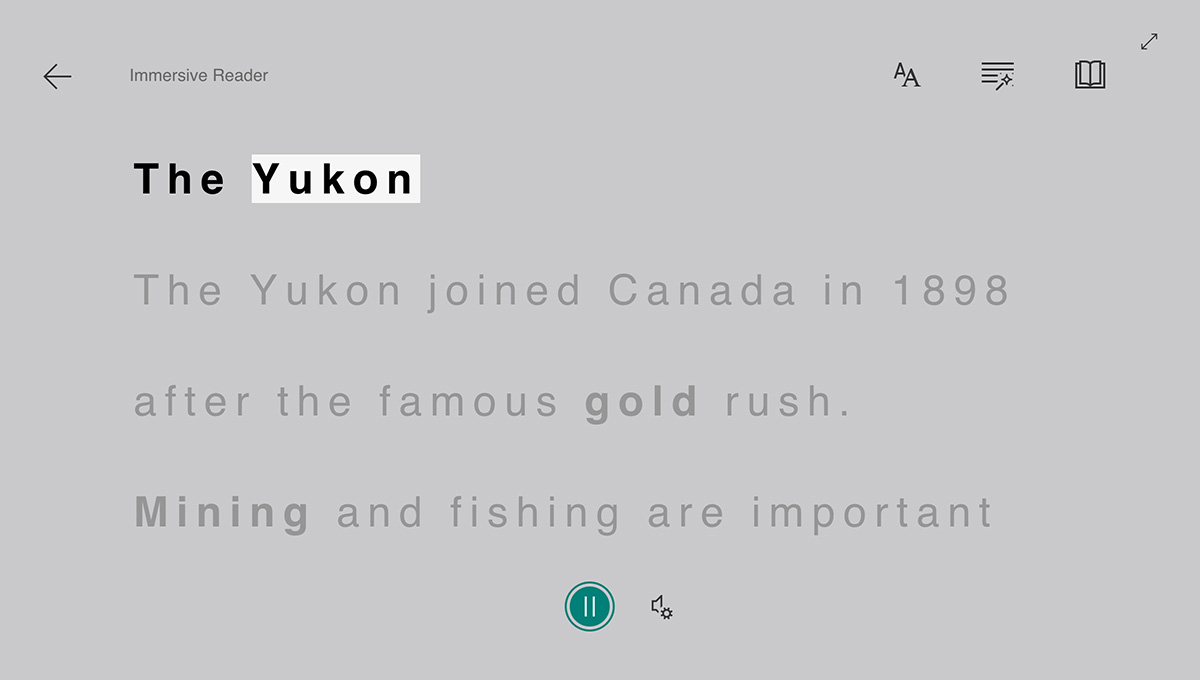
For example, you could help them access the sound files for each Ellii text or introduce them to the Immersive Reader function, which reads texts out loud and describes photos using alt text (a contraction of "alternative text").

You can also include the rest of the class by asking other students to read out loud or describe images, which has the added bonus of additional speaking practice.
Learners with low vision
Learners with low vision, as well as those who need glasses, can be supported using larger fonts and double-spaced text. Use the zoom function on your browser or computer screen to enlarge text and ask learners about their sizing preferences.
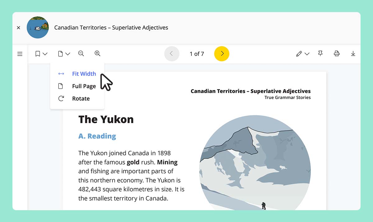
Ellii has a Fit Width option as well as a zoom feature (represented by the magnifying glass icon with a plus sign) to magnify the PDF view on screen.

Don't forget about font size and style!
It's essential to consider font size and style. Sans serif fonts (without "flicks" or "tails") such as Arial, Trebuchet MS, and Calibri are easier to read. Ellii uses Open Sans, which is great for supporting students with low vision.

In general, these font sizes are advisable:
- Print materials = 12 point minimum
- Presentations = 24 point minimum / 36 point recommended
If your students are using their smartphones to access their learning, bear in mind that fonts can be even smaller.
In online classes, ask your students regularly if the text is large enough and make any necessary adjustments.
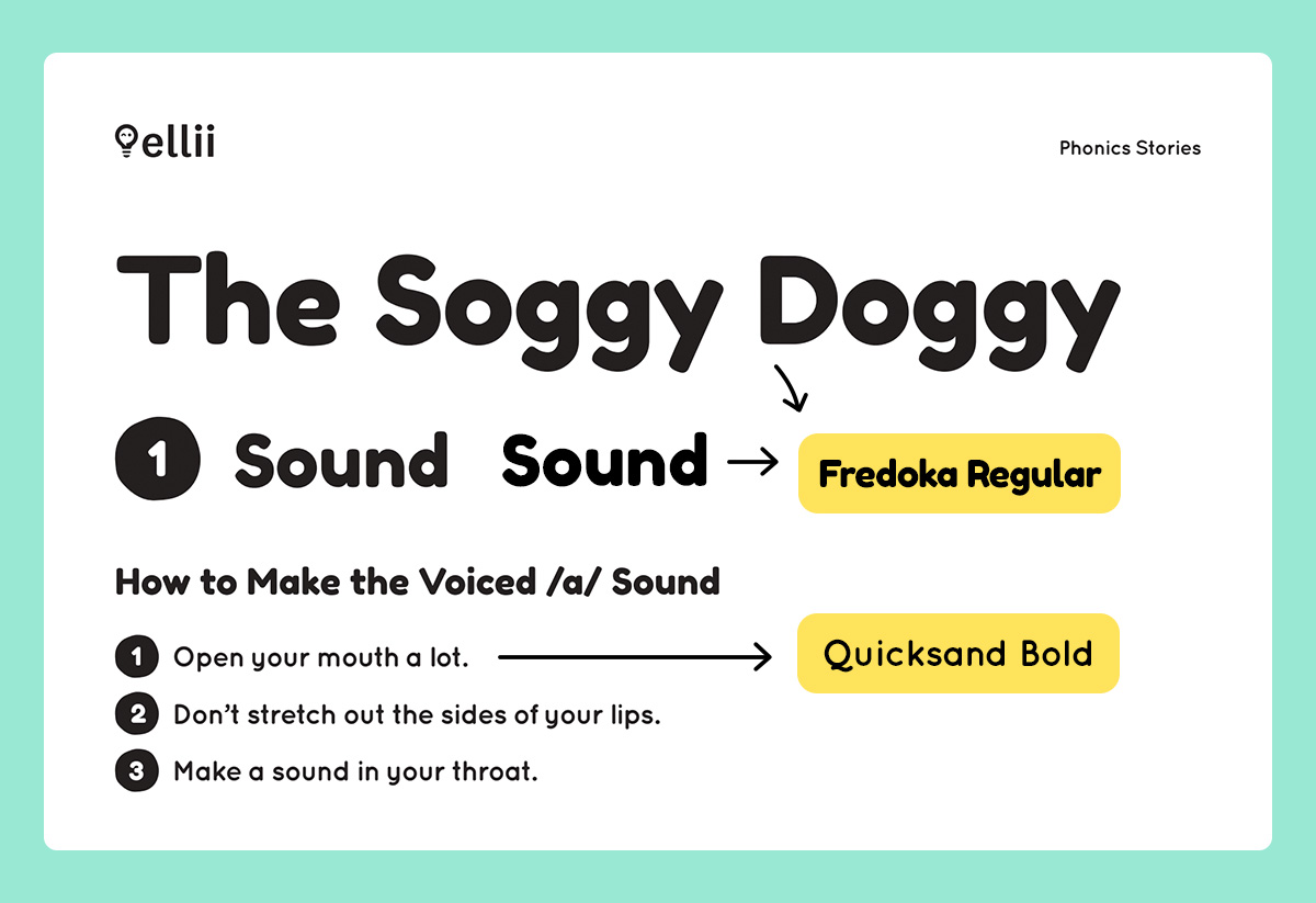
Ellii uses a few different font sizes within their PDF worksheets. You can print these as A3 size paper to increase the font size. Content for young learners or made specifically for adult literacy are set higher at 14 point in a different font (Fredoka and Quicksand).

Learners who are color blind
Color blindness makes it difficult to distinguish and identify certain colors.
Remember to not rely solely on color to convey meaning. Make sure to also circle words, draw arrows, or bold fonts. These will provide clearer visual cues for color-blind students.
Avoid color combinations with red and green as these can be particularly difficult to differentiate.
Supporting all learners
It’s not only blind or low-vision learners who will benefit from these adjustments in class. One small adaptation can be beneficial to many learners.
For example, learners can listen to the audio on the bus home from their language class or when they're making dinner. What's more, pretty much everyone finds larger fonts easier to read.
Do you teach blind or low-vision language learners?
What adjustments have you found helpful? We’d love to hear your ideas and tips. You can read more about Immersive Reader here.
Comments
There are no comments on this post. Start the conversation!